
MyEdVault: The Smart Learning Hub for Training Organizations
MyEdVault is a SaaS platform designed to empower training organizations with structured Course Library, interactive tasks, learning notes, events manager, video hub for the organization, their users and how they are both managed. It enables organizations to create, manage, and track professional training programs for individuals and teams, ensuring measurable skill development.
My Role
As the Product (UI/UX) Designer, I led the product design efforts from concept to delivery — shaping the platform’s structure, experience, and interface.
The Problem
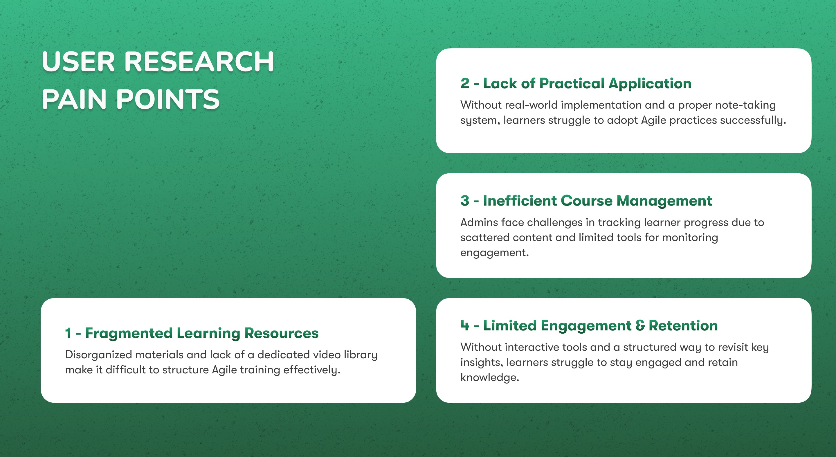
Understanding Our Users
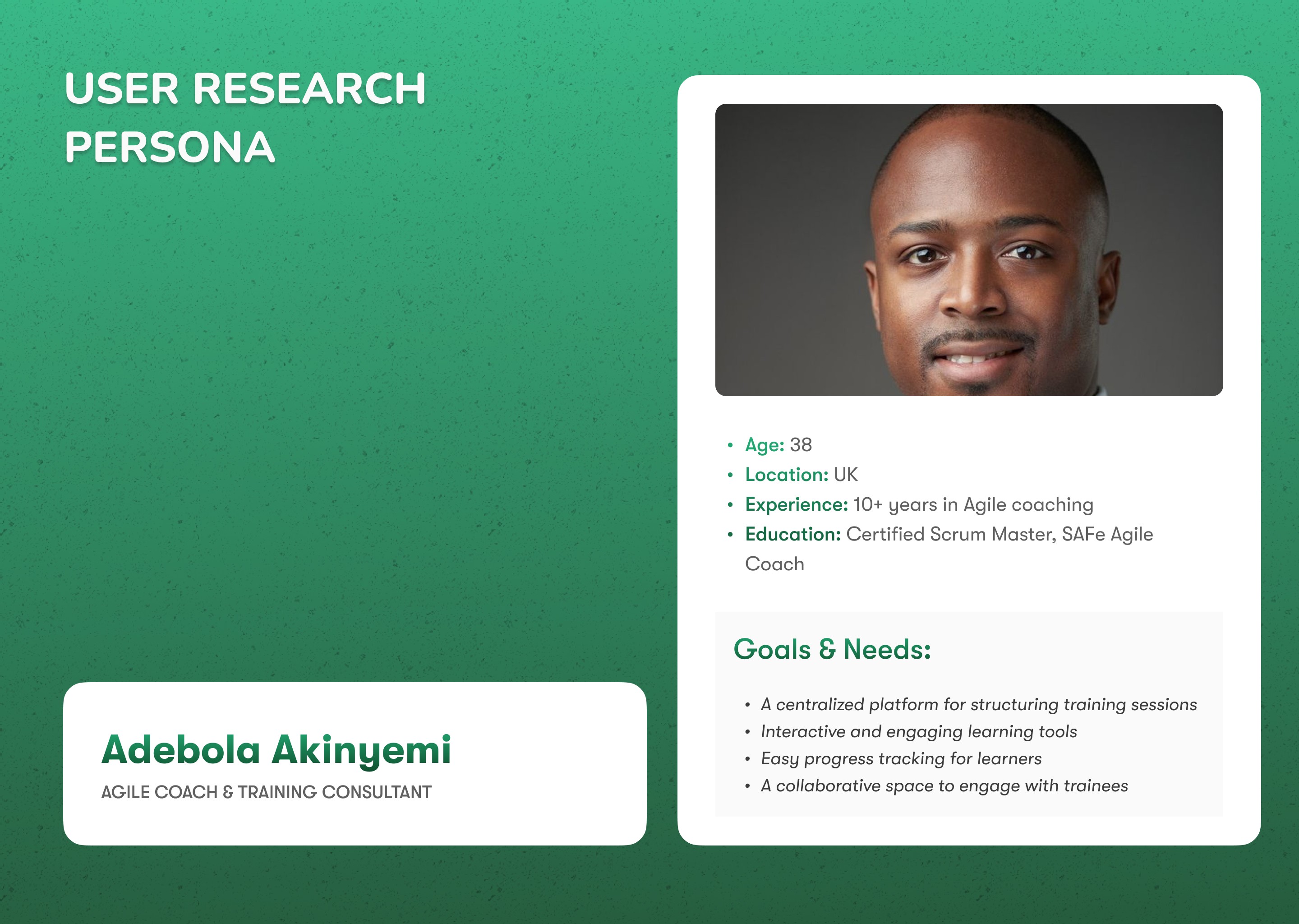
To create a platform that truly meets the needs of Agile professionals and learners, we conducted in-depth user research to identify key pain points and motivations. Our findings helped us define two core personas:
The Agile Coach & Training Consultant – Experts who need structured tools to deliver effective training and track learner progress.
The Working Professional Seeking Agile Certification – Ambitious individuals looking for structured learning resources to balance their studies with a busy work schedule.
By understanding their challenges, goals, and expectations, we can craft a seamless learning experience that enhances knowledge retention, engagement, and real-world application.

A Learning with a Smarter Approach
Understanding the challenges faced by training organizations and learners, we designed a solution that goes beyond traditional learning platforms. Our approach focuses on structured learning, real-world application, and seamless course management—ensuring both trainers and learners achieve their goals efficiently

User research highlighted key pain points:
🔹 72% of training organizations struggle to track learner progress effectively.
🔹 Learners find Agile overwhelming without structured guidance.
🔹 There’s a need for engaging, real-world case studies to improve adoption.
These findings shaped MyEdVault’s core features.
The Outcome:
We are still monitoring the onboarding of platforms to ensure a seamless experience for training organizations.
Early feedback has been positive, with users:
Finding the course library, video library, and admin dashboard valuable for structuring their learning programs.
As we continue to gather insights, we aim to refine the event manager and progress tracking features for better engagement and efficiency.
Design Process: Following the SDLC Framework
Requirement Gathering
I started by speaking with the platform’s founder and stakeholders to understand business goals. Then I interviewed potential users — both learners and admins — to uncover their day-to-day frustrations and must-haves.
Key Insights:
Learners needed motivation, structure, and access to organized content
Admins wanted a clean, easy-to-use dashboard without technical overwhelm
Everyone wanted a platform that "just works" without a steep learning curve
System Analysis
I studied competitors (like LMS tools and study platforms) to spot opportunities. Combined with user insights, I defined the core user flows and functional requirements for both roles — learner and admin.
This phase helped validate:
Which features to prioritize
What the MVP should look like
The best way to segment the platform’s features for each user group
Design
I translated our findings into wireframes, user flows, and finally, high-fidelity UI designs — all supported by a consistent design system. Every screen was carefully considered to reduce friction and promote ease of use.
Highlights:
Modular course cards, video library, and note-taking tools
A reimagined admin dashboard with clear status indicators and progress tracking
Gamified learning: streaks, badges, and visual progress bars
Implementation (Design Handoff)
I prepared organized files, component specs, and written annotations for a smooth handoff to the development team. I also supported developers by clarifying edge cases, ensuring pixel-perfect implementation.
Handoff Included:
UI style and component libraries
Mobile and web layout specs
Flows for both Leaners, tenants and admins
Testing from interactive prototype
Interactive prototypes were shared with test users. I observed how they navigated the platform, identifying friction points and making iterative improvements based on real-time feedback.
Results from Usability Testing:
Reduced confusion on the admin panel
Increased confidence in navigating the learner dashboard
Clearer understanding of task status and next steps
Deployment & Maintenance
While I wasn’t involved in platform development, I stayed in the loop post-launch, reviewing designs in staging, suggesting UX improvements, and proposing scalable enhancements for future updates.
I also laid the groundwork for future iterations by:
Building a flexible design system
Creating a feature roadmap from user feedback
Documenting design logic and decisions
To effectively address identified challenges and elevate the overall learning experience, MyEdVault introduced a range of thoughtfully designed features tailored to the needs of both learners and administrators:
Starting from the Onboarding the Tenants
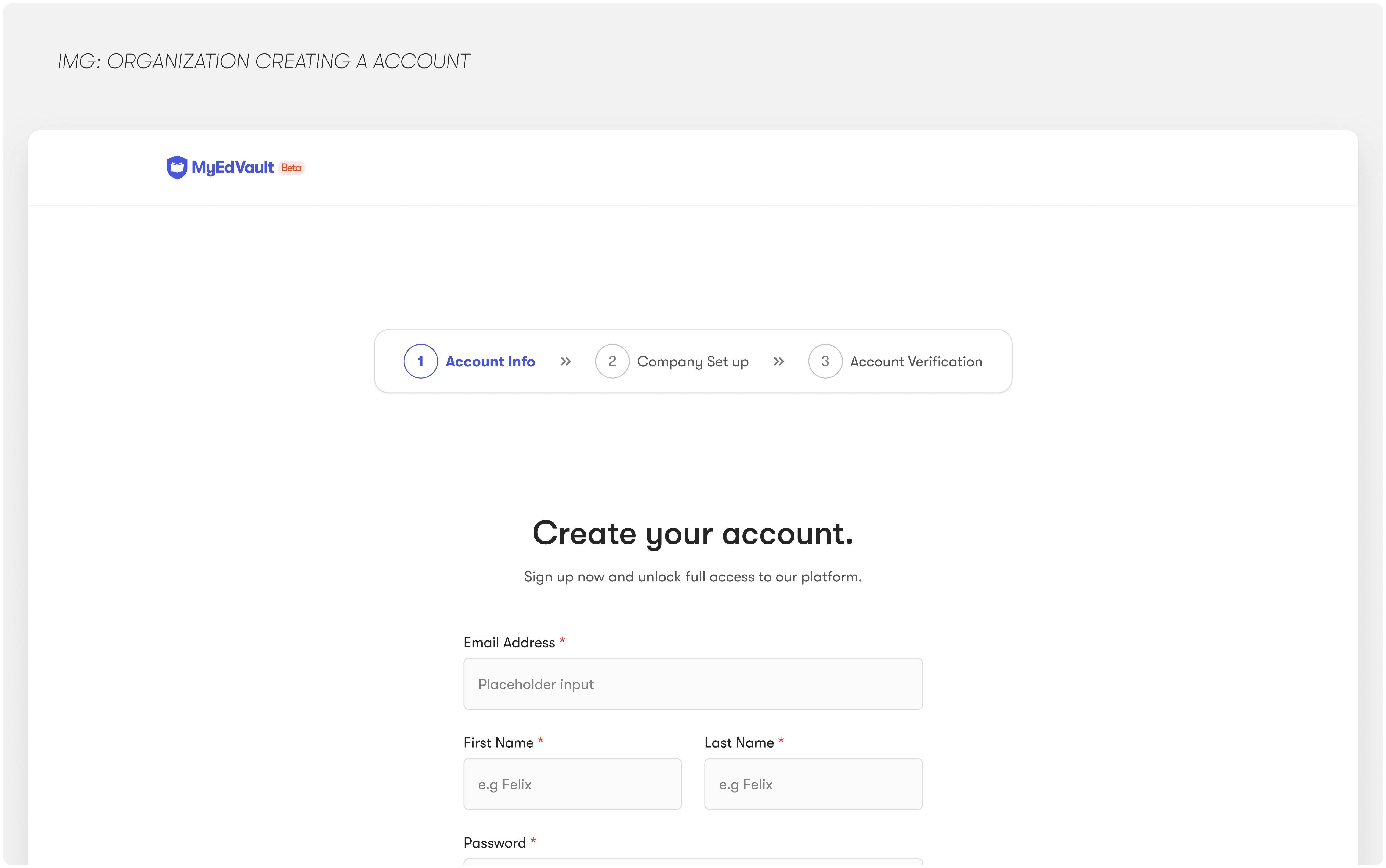
To ensure a smooth onboarding experience, I designed a simple yet effective Create Account screen focused on clarity and ease of use. It minimizes friction for new users by guiding them through a straightforward sign-up flow, setting the tone for a seamless learning journey on MyEdVault.
Outcome
The streamlined sequential sign-up flow led to a 22% increase in account creation completion rate, with users reporting a clearer understanding of the platform’s value from the start. It significantly reduced onboarding drop-offs and improved overall first-time user experience.
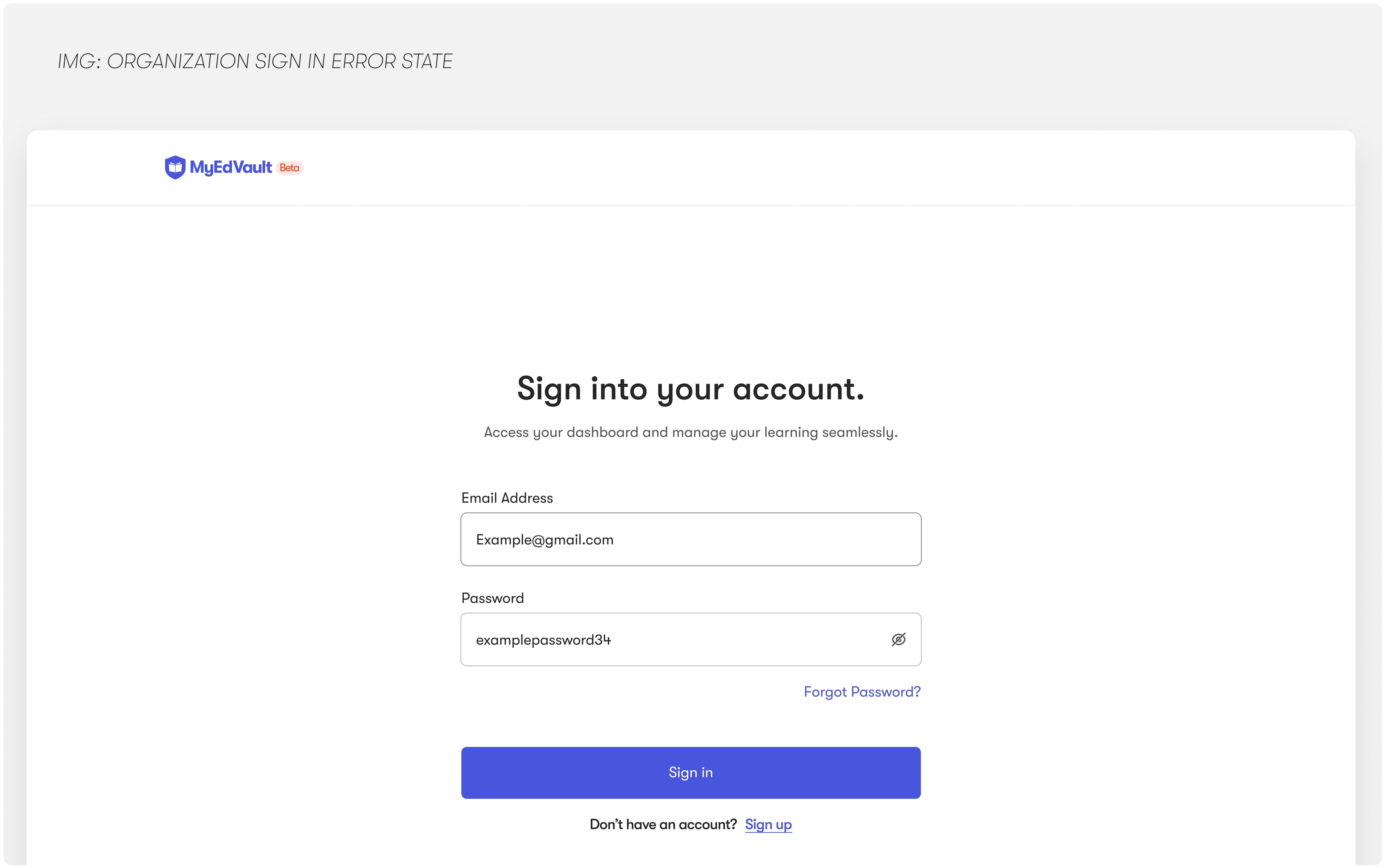
To make returning to the platform feel seamless and familiar, I designed a clean, intuitive Sign In screen that prioritizes clarity and ease. Key decisions included simplifying the input flow, adding helpful microcopy, and ensuring responsive design across devices, all aimed at minimizing barriers for repeat users.
Outcome
Attention to details from microcopy, visual hierarchy, and adding subtle trust indicators (like “secure login” notes and brand consistency), we increased user confidence and saw a 15% drop in support tickets related to login issues, reinforcing platform credibility from the first interaction.
Handling error states from the Onboarding the Tenants
To reduce drop-offs and confusion during account creation, I designed clear and helpful error states that guide users when they make mistakes. Instead of generic error messages, each alert provides specific feedback (e.g., “Password must be at least 8 characters”) and maintains a friendly tone to keep the experience supportive, not frustrating.

Wrong email


The first iteration shows exact error point for the users, however the one below shows a generic error state.
Another thing learnt in this project is BALANCING UX AND SECURITY.
In the First Iteration, the aim is to simplify the user experience and reduce confusion or cognitive load, However the second iteration show less proximity to cyber attacks as the won't know which is wrong or correct.

Second iteration for the Sign in error screen.
Handling Payment from the Tenants (MVP)
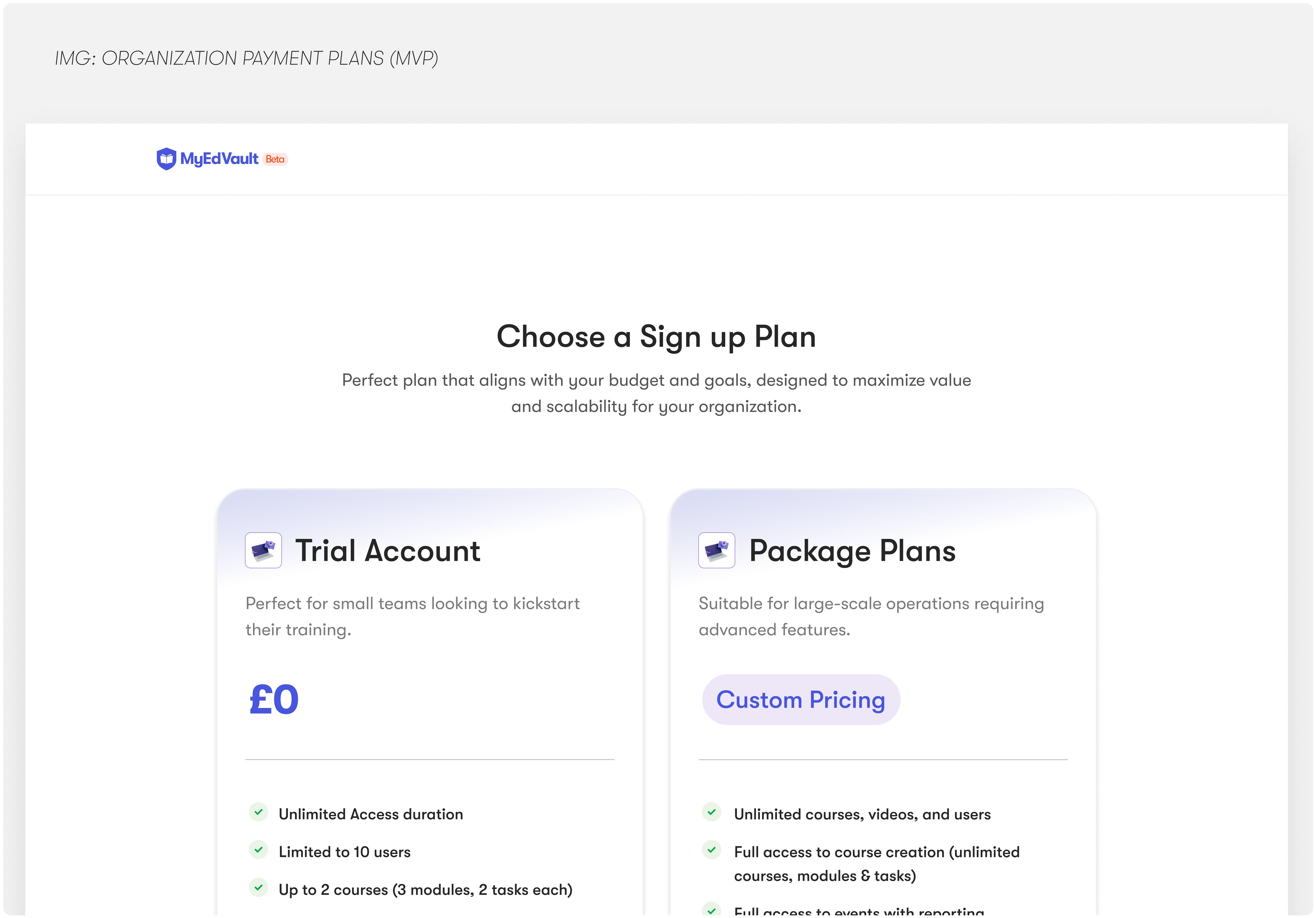
To validate monetization early, we introduced a minimal yet effective payment setup. Users could either explore the platform through an Unlimited but restricted Trial Account or request access to a Custom Package, tailored for organizations with specific training needs. This approach balanced user onboarding with revenue experimentation while keeping friction low.
Outcome
This MVP structure helped us convert 20% of trial users into paying clients and gather valuable insights from enterprise leads, shaping future pricing tiers and product offerings.
Moving Forward?
Designing MyEdVault taught me how to balance simplicity with depth: especially when building for learners, admins, and growing product teams. It was about more than just clean UI; it was about making learning feel easy, motivating, and accessible.
As I take on new projects, I’m excited to bring this same energy into other spaces—whether it’s SaaS, productivity, or purpose-driven platforms. I’m always looking for ways to design smarter, build faster, and create experiences people actually enjoy using.

